The Calm Bedroom Palette: 5 Colors That Sleep Researchers Love
Soft sage, dusty rose, oat — the science-backed colors that quiet a busy mind.
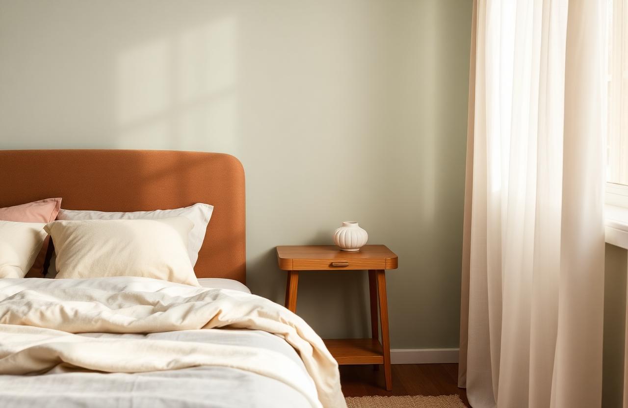
Your bedroom should be the quietest room in the house — not in decibels but in visual noise. A calm palette helps your brain transition from doing to resting, which is why sleep researchers keep coming back to the same handful of colors. Here are the five tones that promote rest, plus the science behind why they work and how to use them in your own bedroom without making the room feel cold or boring.
Why color affects sleep
Color influences mood, and mood influences sleep quality. Research consistently shows that cool, muted tones — particularly soft greens, blues, and neutrals — lower heart rate and blood pressure more effectively than warm or saturated colors. That doesn't mean you should paint your bedroom hospital blue; it means soft, desaturated colors help your body wind down while bold ones keep you alert.
The goal is calm without cold. You want colors that feel restful but still cozy. The five shades below walk that line.
The five calm bedroom colors
- ✓Soft sage green — Grounded and natural. Pairs beautifully with warm wood and cream.
- ✓Dusty rose — Warm without being stimulating. Surprisingly neutral on a full wall.
- ✓Oatmeal / warm beige — The perfect warm neutral. Disappears into the background while adding warmth.
- ✓Mushroom gray — Cool enough to calm, warm enough to hug. Works with any accent.
- ✓Soft lavender — A sleeper hit. Pale purple is soothing and subtly sophisticated.
All five are low-chroma — meaning they're muted, not saturated. That matters. Saturated colors (think neon or jewel tones) stimulate the eye; muted colors let it relax.
What to avoid in the bedroom
Red and orange raise energy levels — not ideal for sleep. Bright yellow is cheerful but can feel jarring at night. Pure white often reads cold, especially in rooms with cool northern light. If you want light walls, choose a warm white like Benjamin Moore White Dove or Farrow & Ball Pointing.
"Calm walls, warm textiles, soft light. That's the formula."
— Maya Patel
Frequently asked questions
Is dark paint okay in a bedroom?
Yes, if you like the mood. Dark rooms can feel cocoon-like and restful. Just make sure you have good lighting for when you need it.
Should I paint the ceiling too?
Painting the ceiling a soft color (same as the walls or one shade lighter) can make the room feel enveloping. White ceilings are fine, but matching or coordinating adds polish.
What if I rent?
Use bedding, curtains, and rugs to bring in your calm palette. A large duvet in soft sage or dusty rose carries the same weight as a painted wall.
Can I mix two of these colors?
Yes. Sage walls with dusty rose accents, or oatmeal walls with lavender linens — they play well together because they're all low-chroma.
How do I know if a color is too saturated?
Test it in the space. If it pops off the wall under natural light, it's probably too vivid for sleep. You want the color to recede, not advance.
Final thoughts
Your bedroom palette should feel like an exhale. Choose colors that calm you, test them in real light, and layer soft textures to keep the room warm. Sleep is too important to fight your walls every night.
Pin this for later
Save this guide to your Pinterest board so it's there when the weekend hits.
📌 Pin it on PinterestWas this helpful?

Maya Patel
Bedroom & Bath Editor
Maya leads our bedroom and bathroom coverage at HomeBliss. A former boutique-hotel design consultant, she now writes about how to make small, soft, restful rooms at home without spending hotel money. She lives in a 720-square-foot London flat she shares with her partner and far too many candles.
Related articles
Small Bedroom Ideas 2026: Make 90 Square Feet Feel Like a Suite
Six tricks I steal from boutique hotels to make a tiny bedroom feel calm, soft, and twice its size.
Maya Patel·10 min read
The Four-Layer Bedroom Method That Always Looks Designed
The stylist's formula for a bed that feels like a sanctuary — texture, weight, light, and one personal object.
Maya Patel·10 min read