The Best Paint Colors for 2026 (And the Ones to Skip)
The warm, grounded palette that's quietly replacing greige in every magazine spread.
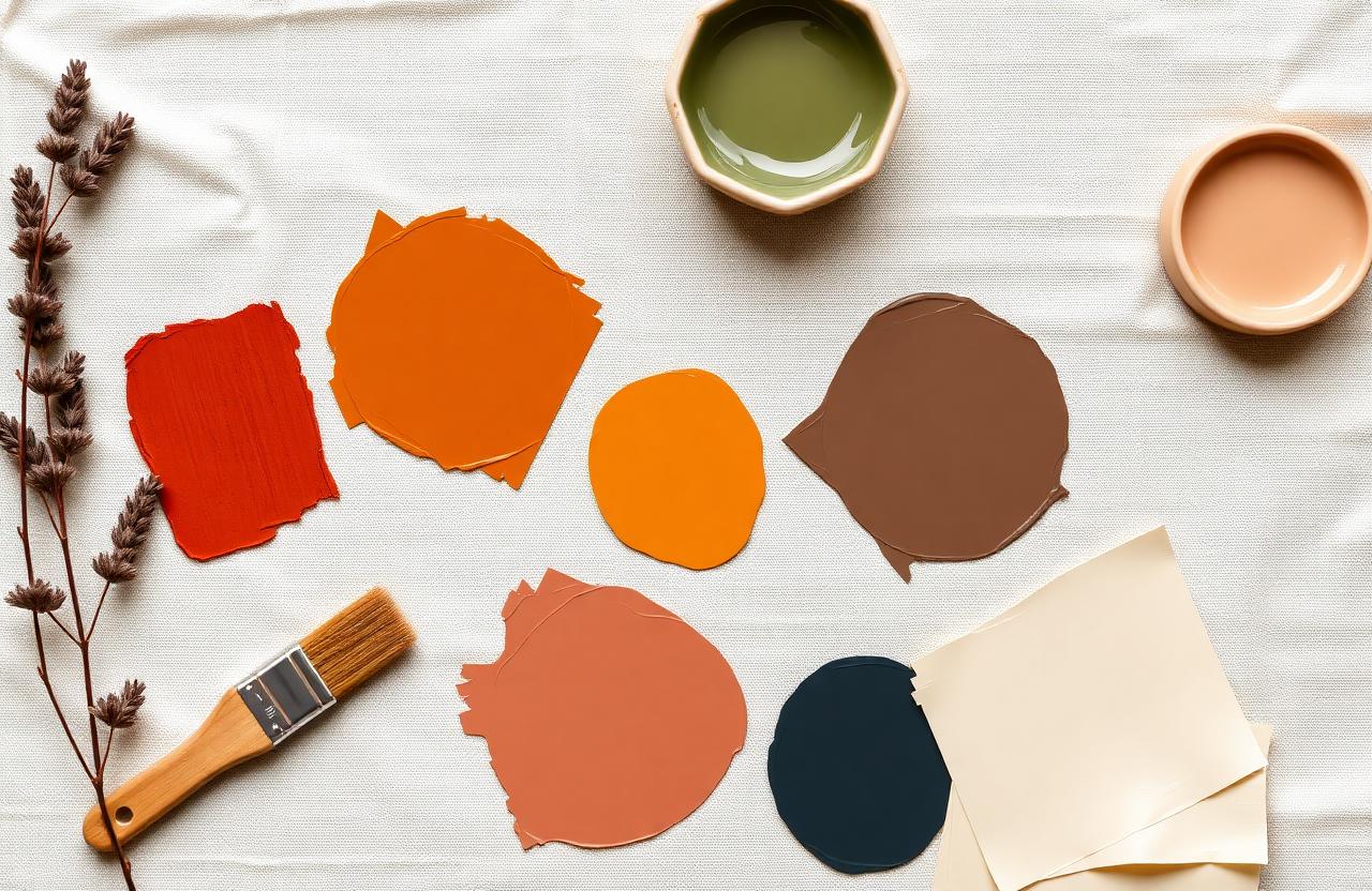
Every few years the design world picks a new neutral to rally around. For a long time it was greige — that muddy middle-ground between gray and beige that promised to go with everything but ended up making every room feel like a waiting room. Then came the dark moody walls, the blush pink moments, and the brief obsession with sage green. Now, in 2026, something different is happening: we are going back to warmth. Real warmth. Terracotta, honey amber, soft clay, dusty rose — colors that feel like afternoon light instead of fluorescent light. Here are the six paint colors I keep recommending, plus two that were everywhere last year and already feel dated.
Why warm earth tones are taking over
The pandemic years made us all look a little more critically at our homes, and one thing became obvious: cold colors don't hug you. Cool grays and stark whites photograph well but can feel unwelcoming day after day. Warm earth tones — terracotta, ochre, sage — do the opposite. They soften hard edges, play well with natural materials like wood and linen, and make even a small apartment feel like somewhere you actually want to be.
This isn't just a trend; it's a correction. After years of minimalist white boxes and industrial gray everything, people are craving coziness. We want rooms that feel grounded, not antiseptic. The earth-tone palette delivers that without sacrificing style. These colors have been used in Mediterranean and desert architecture for centuries because they work with natural light and natural materials. We're just rediscovering what cultures around the world already knew.
The six colors I recommend in 2026
These are actual paint colors I've used in client homes or my own projects over the past year. They read well in person, photograph beautifully, and play nicely with wood floors, linen curtains, and brass hardware.
- ✓Terracotta Glow (Benjamin Moore HC-64) — A warm, sun-baked clay that feels bold without shouting. Perfect for an accent wall behind a sofa.
- ✓Garden Sage (Sherwin-Williams SW 6178) — A muted green-gray that pairs perfectly with warm wood and cream. Restful in bedrooms.
- ✓Honey Amber (Farrow & Ball India Yellow) — A rich golden tone that feels vintage and sophisticated. Best in small doses or dining rooms.
- ✓Dusty Rose (Clare Paint Wing It) — A soft pink with enough brown to avoid feeling juvenile. Gorgeous in bathrooms and bedrooms.
- ✓Warm Cream (Benjamin Moore White Dove) — The perfect warm white. Not yellow, not pink, just warm. Use it everywhere else.
- ✓Deep Navy (Sherwin-Williams SW 6244) — A grounding anchor color for one wall or a statement piece. Mix with brass and linen for warmth.
Two colors to skip this year
I am not saying these are bad colors — just that they are starting to feel dated in the context of current design trends. If you painted your home in 2021-2023, chances are one of these showed up.
First: stark, cold gray. It dominated the mid-2010s and now reads as tired. If your walls are SW Agreeable Gray or something similar, consider warming things up with textiles before committing to a repaint. Second: millennial pink. It had a good run, but the bubble-gum-adjacent tones feel very 2019 now. Dusty rose is the evolution — same family, more grown-up.
How to choose your accent wall
Not every wall needs color. In most rooms, one accent wall is enough. The rule I follow: pick the wall that your eye lands on first when you enter the room. Usually that's the wall behind the largest piece of furniture — the sofa in a living room, the bed in a bedroom. Paint that wall and leave the rest white or cream. The contrast anchors the space.
"Warm colors hug you. Cold colors photograph well but don't comfort. Choose the hug."
— Emma Clarke
Frequently asked questions
Will terracotta go out of style?
Terracotta has been used for centuries in architecture around the world. It's not a trend; it's a classic. The current moment is just reminding us it exists. Paint is also relatively cheap to change if you ever want a refresh.
What sheen should I use?
Eggshell for walls, semi-gloss for trim. Eggshell reflects a small amount of light without looking plasticky, and it's easier to clean than flat paint.
Can I use these colors in a dark room?
Warm tones actually work well in dark rooms because they reflect what light you do have in a flattering way. Avoid true white in low-light spaces — it can look dingy. Go warm.
How many colors should be in one room?
Stick to two or three: a main wall color, a trim color, and one accent if you want it. More than that and the room starts to compete with itself.
What if I'm renting?
Paint is removable. Ask your landlord, save some of the original paint for touch-ups, and go for it. One terracotta wall can transform a bland rental into a home.
Final thoughts
Color is one of the cheapest, highest-impact changes you can make in any room. A single gallon of good paint costs under fifty dollars and takes an afternoon to apply. If your space feels cold, flat, or forgettable, warmth is the answer. Start with one wall, one sample, one afternoon. You can always paint over it — but I don't think you will want to.
Pin this for later
Save this guide to your Pinterest board so it's there when the weekend hits.
📌 Pin it on PinterestWas this helpful?

Emma Clarke
Founder & Editor in Chief
Emma is the founder and editor in chief of HomeBliss. Before starting the magazine she spent twelve years working as an in-home stylist for first-time buyers, renters, and weekend renovators across the UK and US. She believes the best decorating advice is honest, repeatable, and tested in a real home with a real budget — preferably one with a curious dog underfoot.
Related articles
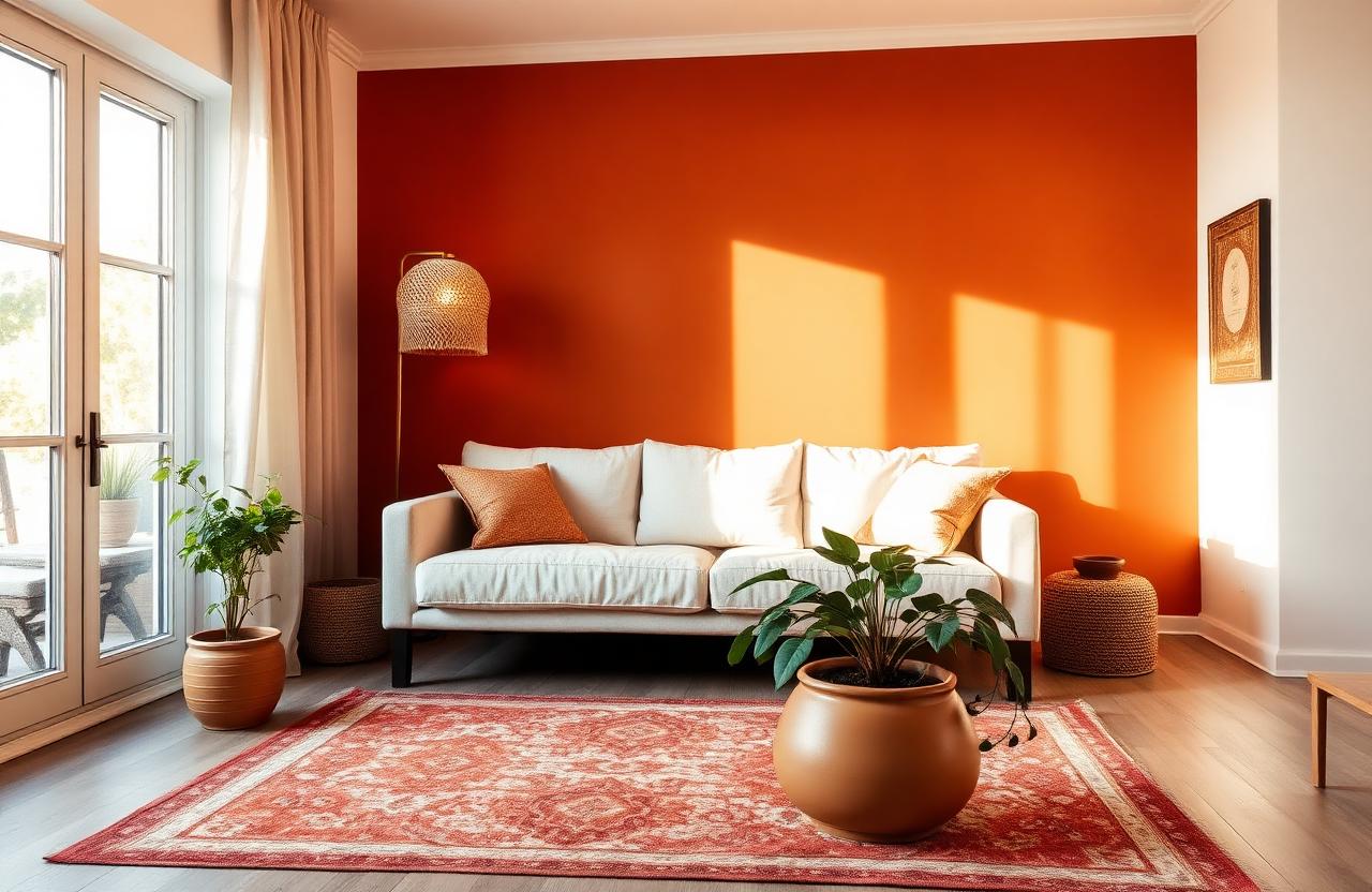
How I Refreshed My Entire Living Room for Under $500
You don't need a designer's budget to get a designer's look — here's the exact weekend playbook I used.
Emma Clarke·12 min read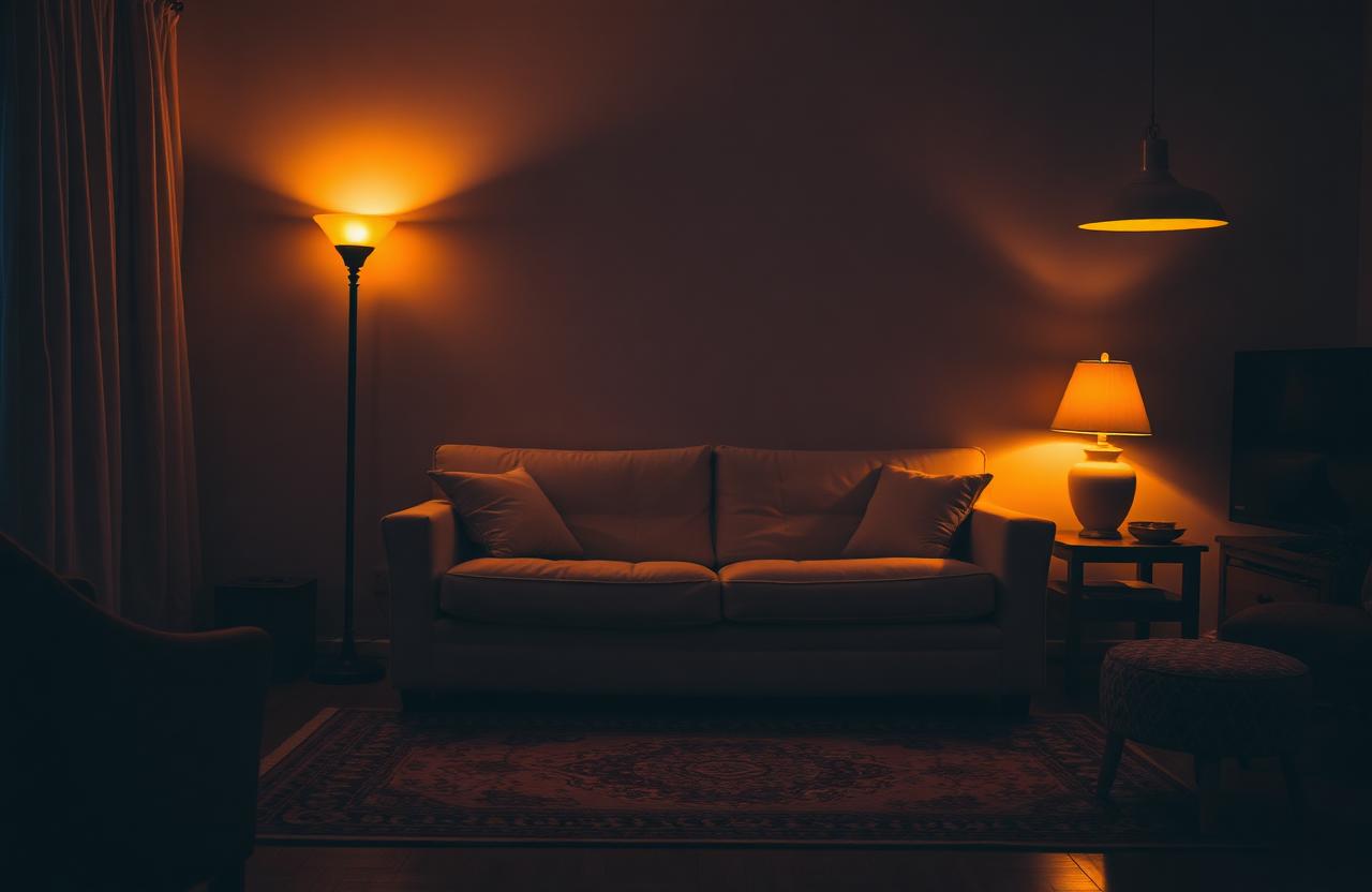
The 3-Lamp Rule That Instantly Makes a Living Room Feel Designed
Three lights at three heights — the formula every interior stylist uses without thinking.
Emma Clarke·8 min read